There, There - Double India Pale Ale
Label Artwork
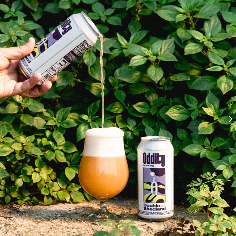
"There, There," is an evocative label artwork that captures the essence of the product and its brand. The choice of the Radiohead song title as the beer's name adds an element of cultural significance and appeal, while the artwork of a flower with a mountain backdrop is both visually striking and symbolic.
The flower in the foreground is an intriguing and mysterious element that suggests a deeper meaning or story behind the beer's name and identity. The mountain backdrop adds a sense of grandeur and adventure, as if the beer is the perfect refreshment for a challenging hike or outdoor adventure. The use of contrasting colors and bold, minimalist design effectively communicates the brand's identity and distinguishes "There, There" as a unique and desirable offering in the competitive craft beer market.
Overall, the label artwork is a combination of artistry and branding strategy. It captures the attention of potential customers and communicates the essence of the product and its brand in a way that is both visually stunning and emotionally resonant. It is sure to become a beloved and recognizable icon of the local Barcelona craft beer scene.


